The Key Visual Design Rules That Every Interior Designer Should Know
The Key Visual Design Rules That Every Interior Designer Should Know
Good interior design is not only about selecting beautiful furniture, finishes, colours or decorative elements. A successful space works because people see, interpret and emotionally respond to the environment in a particular way.
Understanding visual design principles can help interior designers create spaces that are not only aesthetically pleasing but also functional, comfortable and memorable. From lighting and colour to shapes and visual information, these principles influence how users experience an interior.
For anyone planning a residential, commercial or office project, working with an experienced interior designer near me can help translate these principles into practical design decisions.
Here are eight key visual design rules that every interior designer should understand.
1. Light Source Bias (光源偏见)
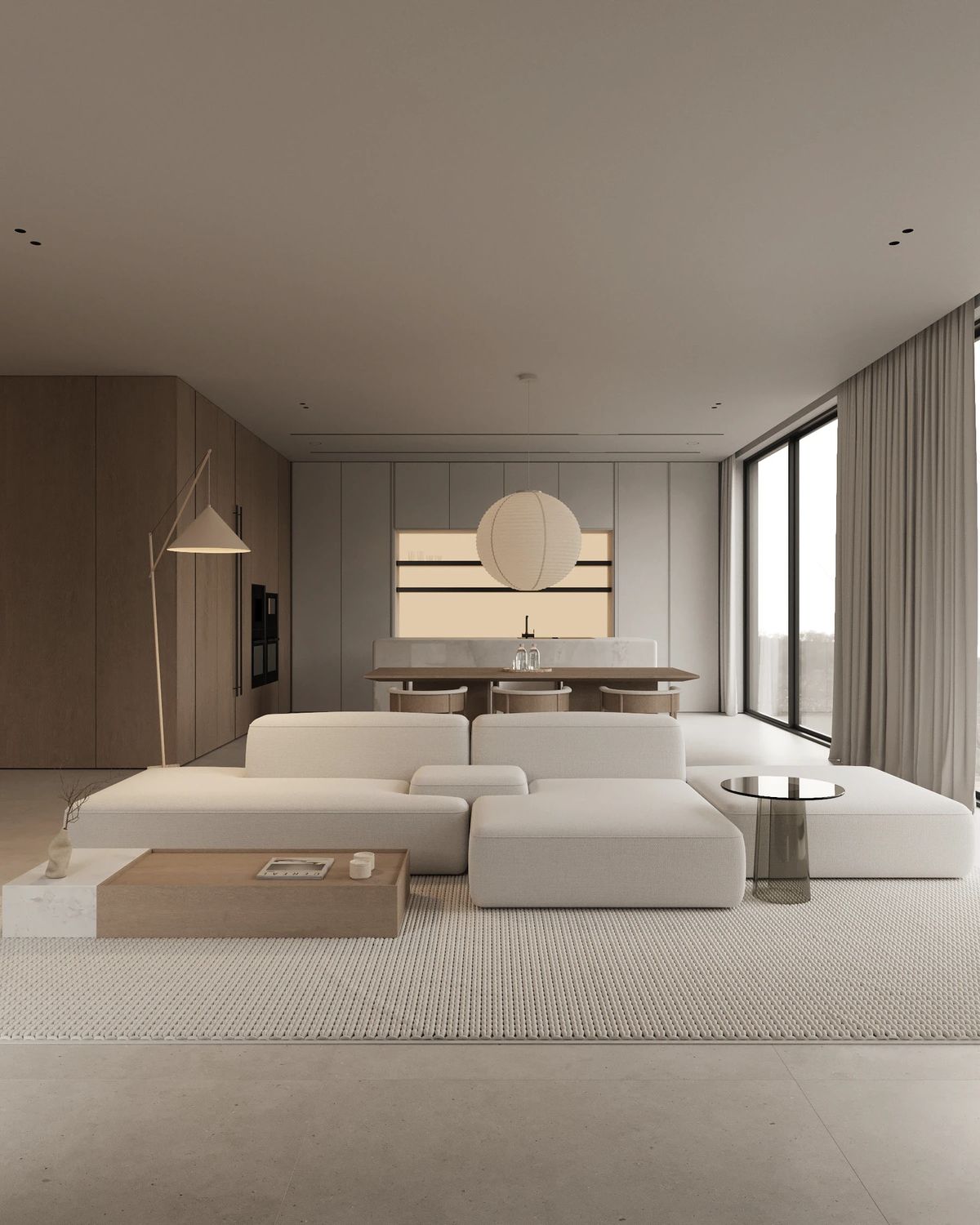
Lighting is one of the most influential elements in interior design because it affects how we perceive almost everything else in a space.
Our brains naturally make assumptions about where light is coming from. When lighting comes from an unexpected direction or creates inconsistent shadows, objects can appear visually confusing or unnatural.
In interior design, light source bias can be applied through:
- Natural daylight from windows and skylights
- Ceiling-mounted lighting
- Wall lights and sconces
- Cove and indirect lighting
- Decorative pendant lights
- Task lighting
- Accent lighting
For example, a living room with warm indirect lighting can feel more comfortable and relaxing, while brighter task lighting can make a kitchen or workspace feel more functional.
Practical design tip
Don't simply count the number of lights in a room. Consider where the light comes from, what it illuminates and how shadows are created.
A well-designed lighting scheme should support the room's function while creating visual hierarchy.
2. Signal-to-Noise Ratio (信噪比)
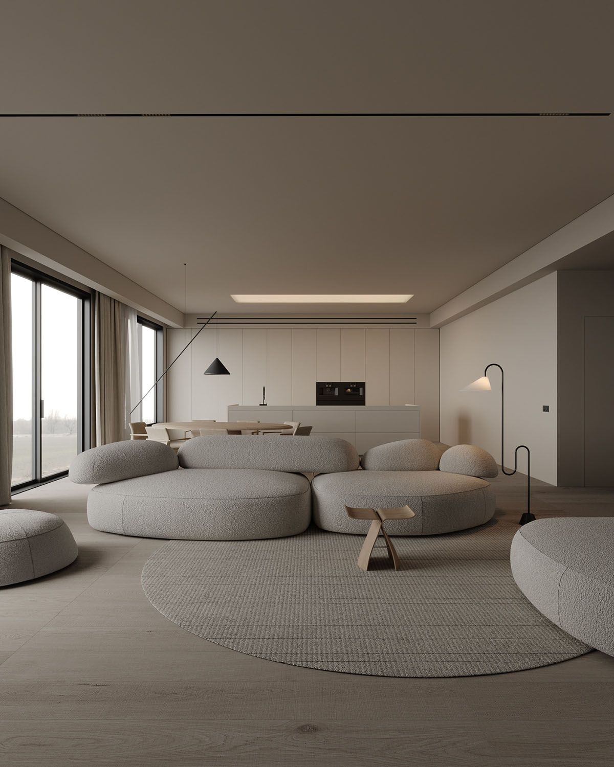
In visual design, the signal-to-noise ratio describes the relationship between important information and unnecessary visual information.
A space with too many colours, materials, patterns, furniture pieces and decorative objects can become visually overwhelming.
On the other hand, a space with a clear visual hierarchy allows important elements to stand out.
For example, an office interior may contain:
Signal:
- Reception counter
- Company branding
- Meeting rooms
- Wayfinding
- Workstations
Noise:
- Excessive decoration
- Unnecessary patterns
- Too many competing colours
- Poorly organised cables
- Cluttered storage
This principle is particularly important in office interior design Johor Bahru, where the environment needs to balance branding, productivity, functionality and employee comfort.
Practical design tip
Before adding another decorative element, ask:
"Does this improve the space, or does it compete with something that is already important?"
Sometimes removing an element can improve a design more than adding another one.
3. Mapping (映射)
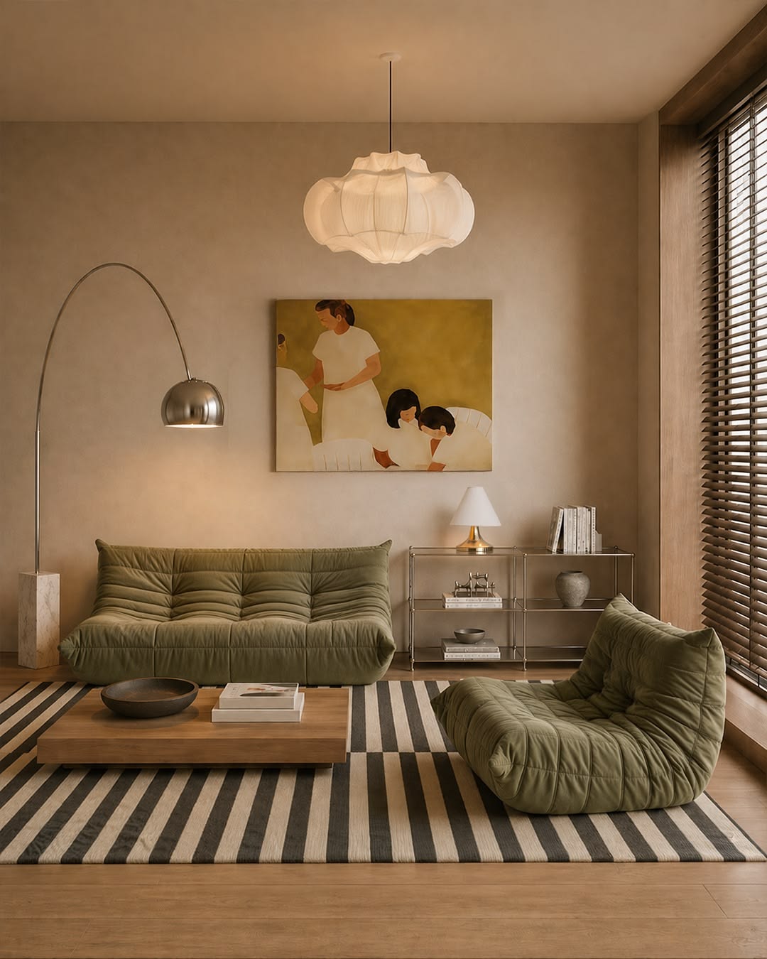
Mapping refers to the relationship between a visual element and its intended function.
In interior design, people should be able to understand how to interact with a space without needing extensive instructions.
For example:
- A large handle suggests where a cabinet should be opened.
- A countertop indicates where preparation takes place.
- A large table surrounded by chairs suggests a meeting or dining function.
- A pathway through furniture naturally indicates circulation.
- Different floor finishes can visually separate different zones.
Good mapping makes an interior feel intuitive.
Practical design tip
Think about how someone unfamiliar with the space would use it.
Can they immediately understand:
Where should I go?
Where should I sit?
Where should I store this?
Where should I work?
Where should I enter?
When the answer is obvious, the design is doing its job.
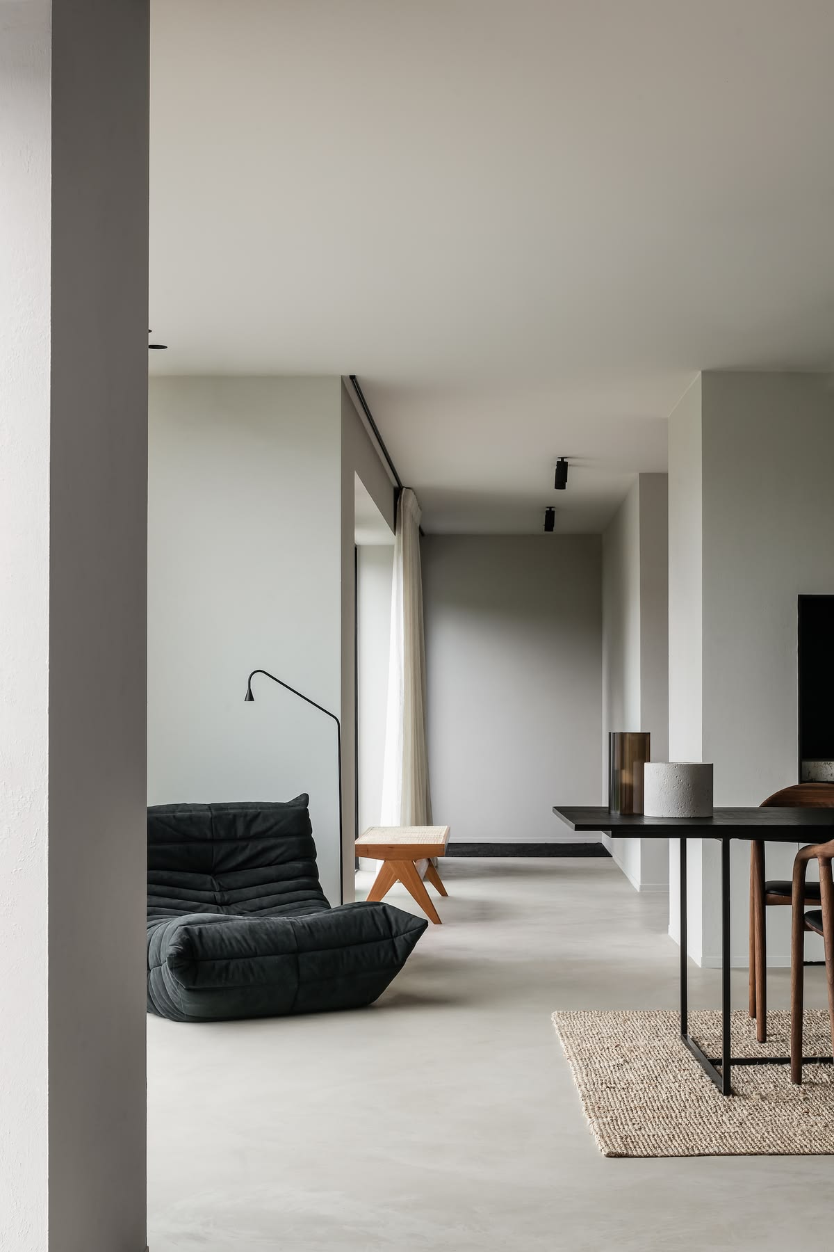
4. Emotional Evolution Theory (情绪进化理论)
People do not experience an interior as a collection of individual objects. They experience it as a sequence.
As someone enters a space, their emotional response can change from curiosity to comfort, excitement, calmness or focus.
This creates an emotional journey.
For example, a hospitality interior might be designed as:
Entrance → Discovery → Reception → Main Space → Private Area → Relaxation
Each area can have a different level of lighting, colour, material and spatial openness.
The same principle can be applied to residential interiors.
A home could transition from:
Entrance: clean and organised
↓
Living room: welcoming and social
↓
Dining area: warm and interactive
↓
Bedroom: quiet and calming
Practical design tip
Instead of designing every room independently, consider how one space visually and emotionally transitions into the next.
This creates a stronger sense of spatial storytelling.
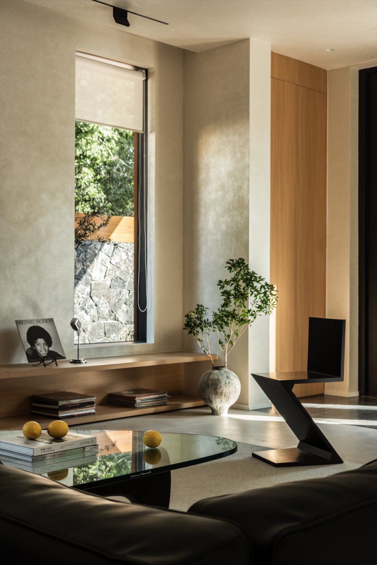
5. Dual Coding Theory (双重编码理论)
Dual Coding Theory suggests that people process information through both visual and verbal channels.
In interior design, this can be useful when designing environments that need to communicate information quickly.
Consider an office, clinic, showroom, educational facility or commercial space.
Information can be communicated through:
- Text
- Icons
- Colour
- Symbols
- Images
- Spatial organisation
- Material changes
For example, a simple icon combined with the word "Meeting Room" can communicate information more effectively than text alone.
Interior design can therefore become a form of visual communication.
Practical design tip
When designing a commercial environment, don't rely entirely on signage.
Use architecture, furniture arrangement, lighting, colour and material selection to reinforce the message.
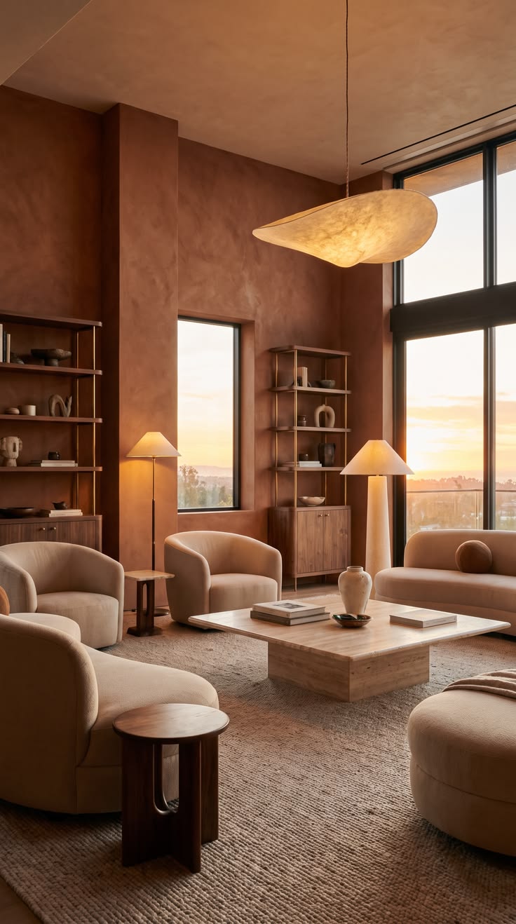
6. Shape Psychology
Shapes can influence how people perceive an environment.
Different forms can communicate different visual qualities.
Curved forms
Curves can create a softer and more organic impression.
They are often used in:
- Sofas
- Feature walls
- Mirrors
- Counters
- Partitions
- Ceiling details
Rectangular forms
Straight lines and rectangular forms can communicate:
- Order
- Stability
- Structure
- Efficiency
They are common in offices, kitchens and contemporary residential interiors.
Organic forms
Irregular or nature-inspired shapes can introduce a more relaxed and natural character.
Shape selection should therefore support the intended atmosphere rather than being purely decorative.
Practical design tip
If a space contains many hard architectural lines, introducing a curved element—such as a mirror, furniture piece or feature wall—can create visual contrast and soften the overall composition.
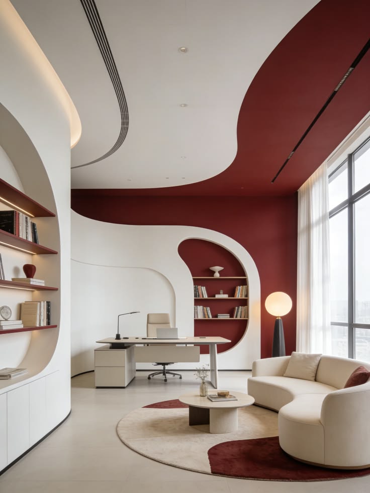
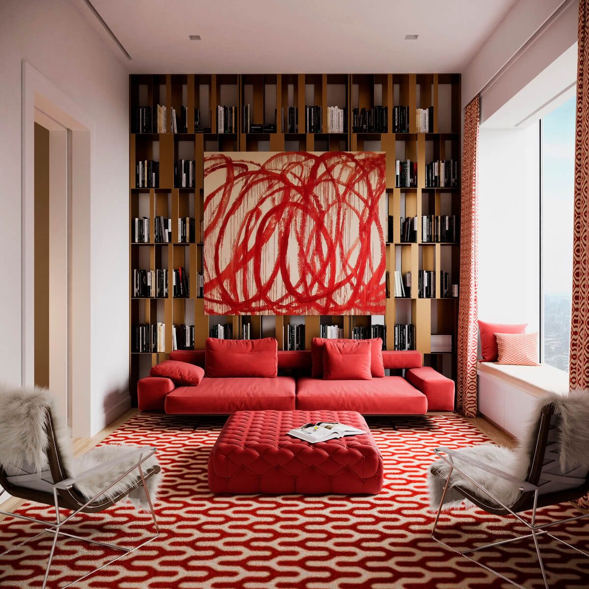
7. Colour Psychology
Colour is one of the most recognisable tools in interior design.
Different colours can influence the perceived atmosphere of a space, although people's responses can also be affected by culture, personal experience, lighting and context.
For example:
- Warm neutrals can create a welcoming atmosphere.
- Cool tones can contribute to a calm and clean appearance.
- Earth tones can reinforce a natural aesthetic.
- Dark colours can create depth and visual weight.
- Bright accent colours can draw attention to specific elements.
Colour should therefore be considered together with lighting and materials.
A colour that looks soft and warm under natural daylight may appear completely different under cool artificial lighting.
Practical design tip
Don't choose colours from a catalogue alone.
Always consider:
Colour + Lighting + Material + Surrounding Colours
These four factors work together to determine the final visual appearance.
8. Colour Constancy
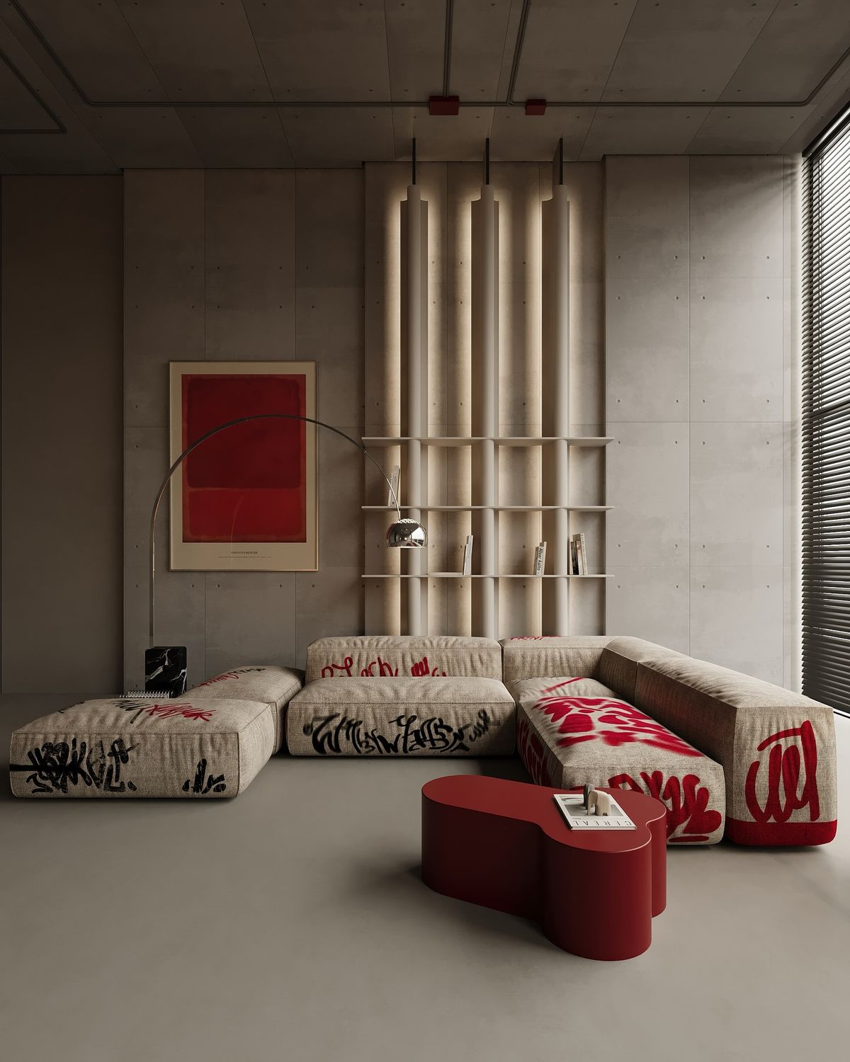
Colour constancy is the tendency of the human visual system to perceive an object's colour as relatively stable even when the lighting conditions change.
For interior designers, however, this also highlights an important practical issue:
The same material or paint colour can look different under different lighting conditions.
For example, a neutral wall may appear:
- Warmer in afternoon sunlight
- Cooler under LED lighting
- Different beside timber
- Different beside white surfaces
- Darker in a shadowed area
This is why material samples should ideally be viewed under the actual lighting conditions of the project.
Practical design tip
Before finalising a colour or finish, test a physical sample in the actual space.
Observe it during:
- Morning
- Afternoon
- Evening
- Natural daylight
- Artificial lighting
This can prevent unexpected results after renovation or construction is completed.
Bringing the Eight Principles Together
These eight principles should not be treated as isolated theories.
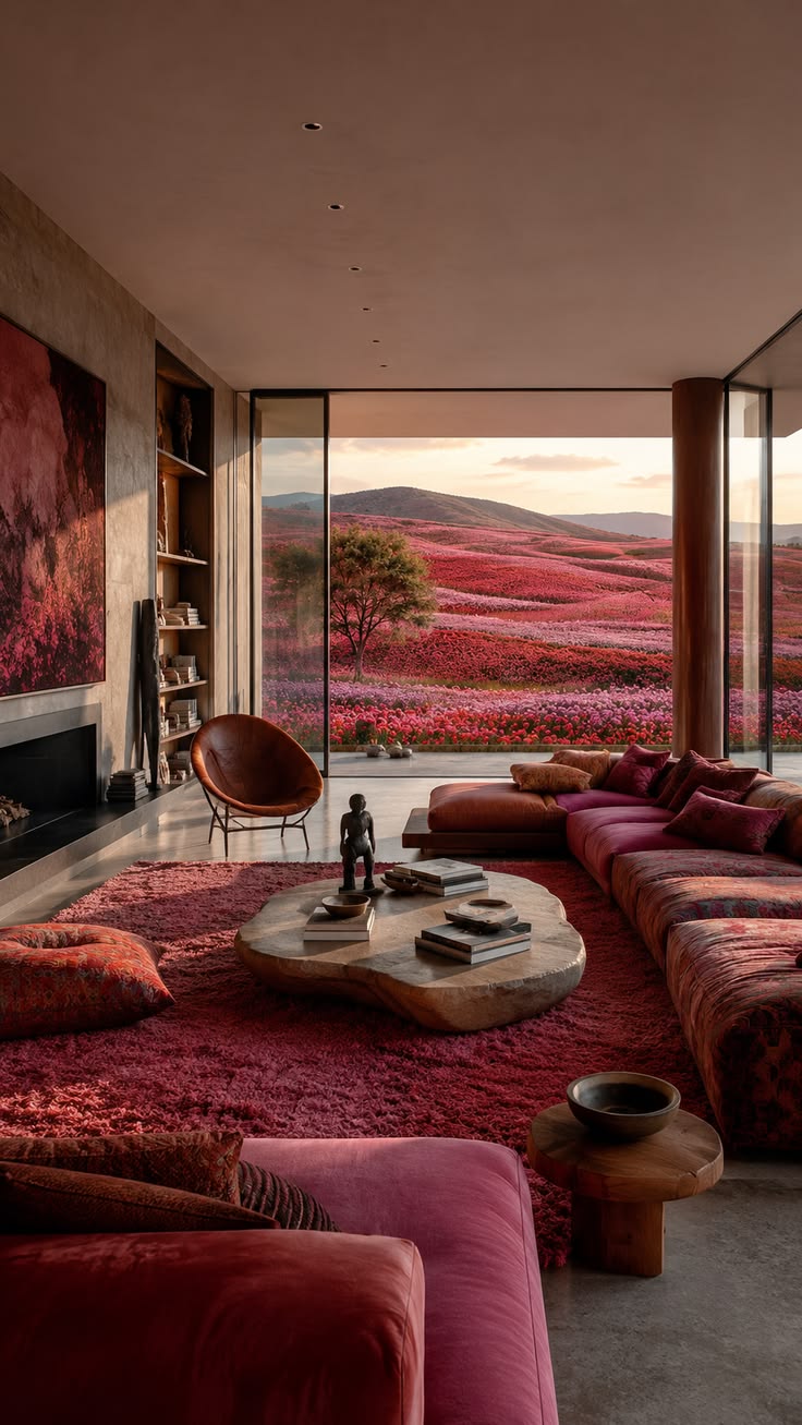
They work together to influence how a person experiences an interior.
For example, consider a modern office:
Light Source Bias determines how the workspace is illuminated.
Signal-to-Noise Ratio keeps the environment visually organised.
Mapping helps employees understand circulation and functionality.
Emotional Evolution creates a logical experience from entrance to workspace.
Dual Coding helps communicate information through visual and verbal cues.
Shape Psychology influences the character of furniture and architectural elements.
Colour Psychology establishes atmosphere and visual identity.
Colour Constancy reminds designers to test how colours behave under real lighting conditions.
Together, these principles can turn a space from simply looking good into a space that is easier to understand, navigate and experience.
Why These Principles Matter in Architecture, Renovation and Construction
Visual design decisions should also be considered during the earlier stages of a project.
For Architecture Design Johor Bahru, factors such as building orientation, window placement, daylight and spatial planning can influence the eventual interior experience.
During Renovation Johor Bahru, designers need to consider existing structures, lighting conditions, materials, circulation and the relationship between new and existing spaces.
Meanwhile, Construction Johor Bahru involves translating the design concept into actual built elements. Details such as lighting positions, ceiling levels, wall finishes, built-in furniture and material junctions can significantly affect the final result.
This is why interior design should not be viewed as simply choosing furniture and decoration at the end of a project.
It is a process of coordinating space, light, materials, colour, form, function and human perception.
Final Thoughts
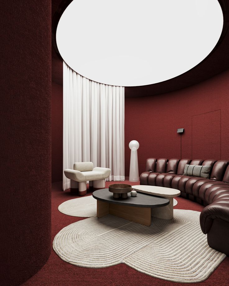
A visually successful interior is not necessarily the one with the most expensive materials or the most decorative elements.
Often, good design comes from understanding how people see and interpret their surroundings.
By applying principles such as light source bias, signal-to-noise ratio, mapping, emotional evolution, dual coding, shape psychology, colour psychology and colour constancy, interior designers can make more deliberate decisions about how a space looks and feels.
Whether it is a home, office, retail space or commercial building, the objective is the same: create an environment where aesthetics and functionality work together.
And that is ultimately what separates decoration from thoughtful interior design.
Explore Our Work:
Get in Touch:
For bespoke interior solutions tailored to your lifestyle and cultural preferences, contact us at +6011-5755 0549. Let’s turn your vision into a crafted reality.
↵Back to Design